All fingers are not the same. In the same way, every typeface has its own unique features. While some may look identical or look like clones of other fonts, a closer look will reveal their distinguishing features.

Today, we are going to take a closer look at two of the most popular fonts Arial and Helvetica. While these two fonts are often confused for one another, today, we’re going to reveal the exact differences between these two typefaces.
Arial and Helvetica – Two Popular Typefaces
When it comes to choosing typefaces for print, web, or digital media, designers will always choose either Arial or Helvetica. These two typefaces are not only popular amongst the designers, but also with other common users as well. These two fonts are pretty common ones found in your system font library.
These two fonts also look very similar that new users won’t be able to spot any difference between the two. But don’t worry, in this article, we’ll dig deeper and provide all the differences between these two typefaces. But before digging deeper, let’s get to know some history about these two typefaces.
Helvetica History
When compared with Arial, Helvetica is the older one. In 1957, Max Miedinger, a Swiss typeface designer came up with this typeface. It was originally designed for the Hass Type Foundry in Switzerland.
It was specially designed to compete with other popular sans serif typefaces and commissioned by Eduard Hoffman. Originally it was named as New Hass Grotesk (New Haas Sans Serif) to identify with its origins.

When Hass Type Foundry was acquired by Linotype, the name was changed to Helvetica. In Latin, Helvetica means Switzerland. Subsequently more weights and versions were added to the typeface and marketed heavily.
One of the core moments that took the popularity of Helvetica to great heights is when it was add to the core font library of Apple OS. It was added along with other popular fonts like Times New Roman and Courier. Since then, it has become hugely popular and widely used by designers and others for various purposes.
Arial History
When compared with Helvetica, Arial has a slightly different history. It was during the time when Adobe was coming up with PostScript, that Monotype got the contract to develop a font library for IBM laser printers.

Robin Nicholas and Patricia Saunders of Monotype developed the Arial typeface in 1982. Microsoft bought the rights to this font and added it to its font library in the systems it supplied throughout the world.
One of the main objectives behind the development of Arial was to mainly compete with Helvetica. Today, Arial has more than 28 weights and versions and is one of the most popular typefaces amongst computer users.
Helvetica vs Arial Design Differences
Even though both these typefaces share several common traits in design, they do have certain differences. While Arial was originally developed for laser printers, it went to be used in computers as well. Helvetica is a typeface specially designed for traditional printing works.
Arial Vs Helvetica Difference
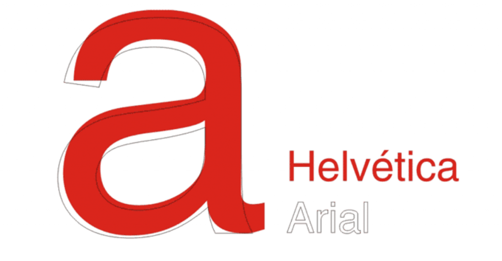
When compared with Arial, the Helvetica fonts come with a quite crisp and sharp design with stylish details. Also, Helvetica fonts are not rounded but appear more rectangular.
If you look closer at the image above, we can see that Arial is more rounded when compared with Helvetica. The letters with Arial have curves that are soft and full along with open counters as well. Hence, in lower resolution printing, these blander appearances provide great output.
Legibility
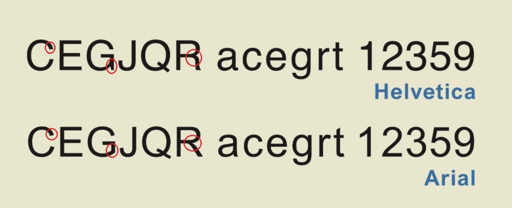
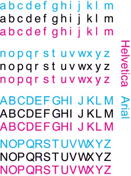
When compared with other sans serif typefaces, both Arial and Helvetica cannot be considered as legible typefaces. For example, both these typefaces don’t have any distinguished difference between the lower case “l” and the capital letter “I” as shown in the image below:
This was first cited in the article titled “Typography for User Interfaces” by Viljami Salminen, a popular designer. He further adds that since Helvetica was originally designed for print works, it doesn’t really suitable for screen displays.
Even though it got popular when it got included in Apple iOS, people did face issues when using it for regular works. It also posed readability problems for some users as well.
Differences in Usage
Arial is a popular font and can be found in all Windows systems and other Microsoft Office applications. It can also be found in MacOS, computer printers and hyper terminals as well.
While Helvetica font cannot be found on Windows computers, it is commonly used as wordmarks on many popular brands like 3M, American Airlines, American Apparel, AT&T, Jeep, BMW, Lufthansa, Microsoft, Toyota, Motorola etc.
Even the Space Shuttle Orbiter from NASA uses the Helvetica typeface. You can also see the Helvetica fonts in most of the subway signs as it was recognized as an official font by the US government since 1989.
Variants
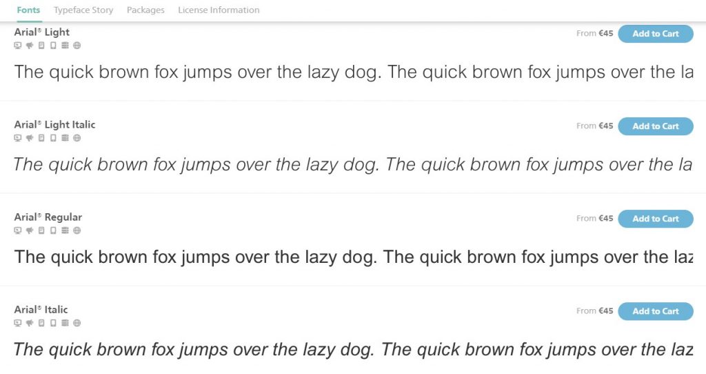
Arial typeface comes included with a lot of styles and variants. The Arial typeface comprises many styles including Regular, Italic, Medium, Medium Italic, Bold, Bold Italic, Black, Black Italic, Extra Bold, Extra Bold Italic, Light, Light Italic, Narrow, Narrow Italic, Narrow Bold, Narrow Bold Italic, Condensed, Light Condensed, Bold Condensed, and Extra Bold Condensed.
Arial typefaces also comes with many aliases like Arial Baltic, Arial CE, Arial Cyr, Arial Greek, Arial Tur etc.
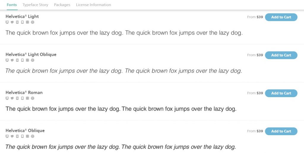
Helvetica comes in two versions namely the Helvetica Greek and the Cyrillic version. There are also other variants of Helvetica which include Helvetica Light, Compressed, Textbook, Inserat, Rounded, Narrow, Neue Helvetica, Neue Helvetica W1G, and Helvetica World.
Conclusion
When you compare both these typefaces, even though Arial is popular, we can say that Helvetica is very well designed. The increased use of Helvetica in the commercial space speaks about the popularity of this font.
But we need to applaud Arial for mimicking Helvetica, but designed for use in printers and later computers as well. Today, Arial is one of the most popular fonts between the two in Windows systems.
We hope today, we’ve provided enough differences between these two popular typefaces. Please post your comments and suggestions in the feedback section below.